Three simple words. A login feature you’ve probably seen across the web and don’t even think about it. Well, at OpenComps, we were painfully slow to implement it. And, as the number one request, we heard it loud and clear from all of you that while the design of our login page is nice and dandy, you were staring at it a bit too often. Dread no more as we finally turned the feature live this week. Now, you’ll be seeing a lot less of the login screen (if you so choose) and focus on your work a little more.
Month: October 2013

While we were busy with our new re-design over the summer, the transactions market didn’t let up either during the “quiet” months of summer which are supposed to be filled with family vacations and BBQs. With the third quarter of 2013, here is an update on our quarterly and year-to-date statistics.
The Q3 one-word summary is: HOT. As in summer hot, but really as a hot transactions market that we are seeing at the moment. Can it get even hotter? We think so. We think we are in a cyclical upturn which hopefully has more legs to run.

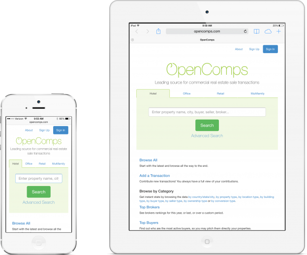
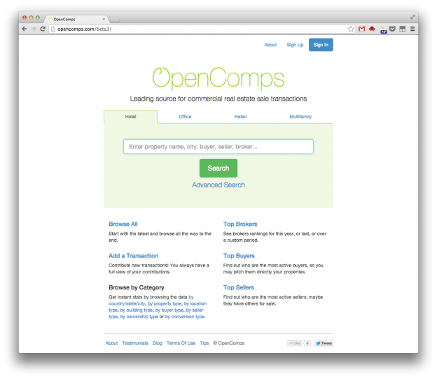
We are very excited about our new design. How about you? But we are not only excited about how (good) we look now on the desktop. The even bigger news is that we are now optimized to look great on your phone or tablet too! Have you tried us out?
There is no new address to remember; no server redirection based on device detected (just go to opencomps.com). Thanks to our new front-end framework, we were able to create a responsive design that adapts to whatever device you are using.

Just as fall is getting started to do a makeover to the trees outside, we are ready with our site makeover too. We worked hard on it all summer and, dare we say, we are very happy with the results. But the final judges will be you, our users…. so we would love to hear your thoughts!
Just to be clear, our makeover is just like a new suit… we may look different, but our simplicity in functionality is still there as you (hopefully, just as much as we) like it. The pockets, buttons and sleeves are still in the same place on the suit, just like our functionality is still there where you can see it and access it conveniently and expediently.